Rebel Cause Digital
Sara had a big idea for her boutique agency: Make work worthwhile by empowering businesses, marketers, and communities. She needed a new brand identity to better resonate with her audience and set her apart. Work got underway exploring various logo concepts. Some direct evolutions of the original logo—others not.
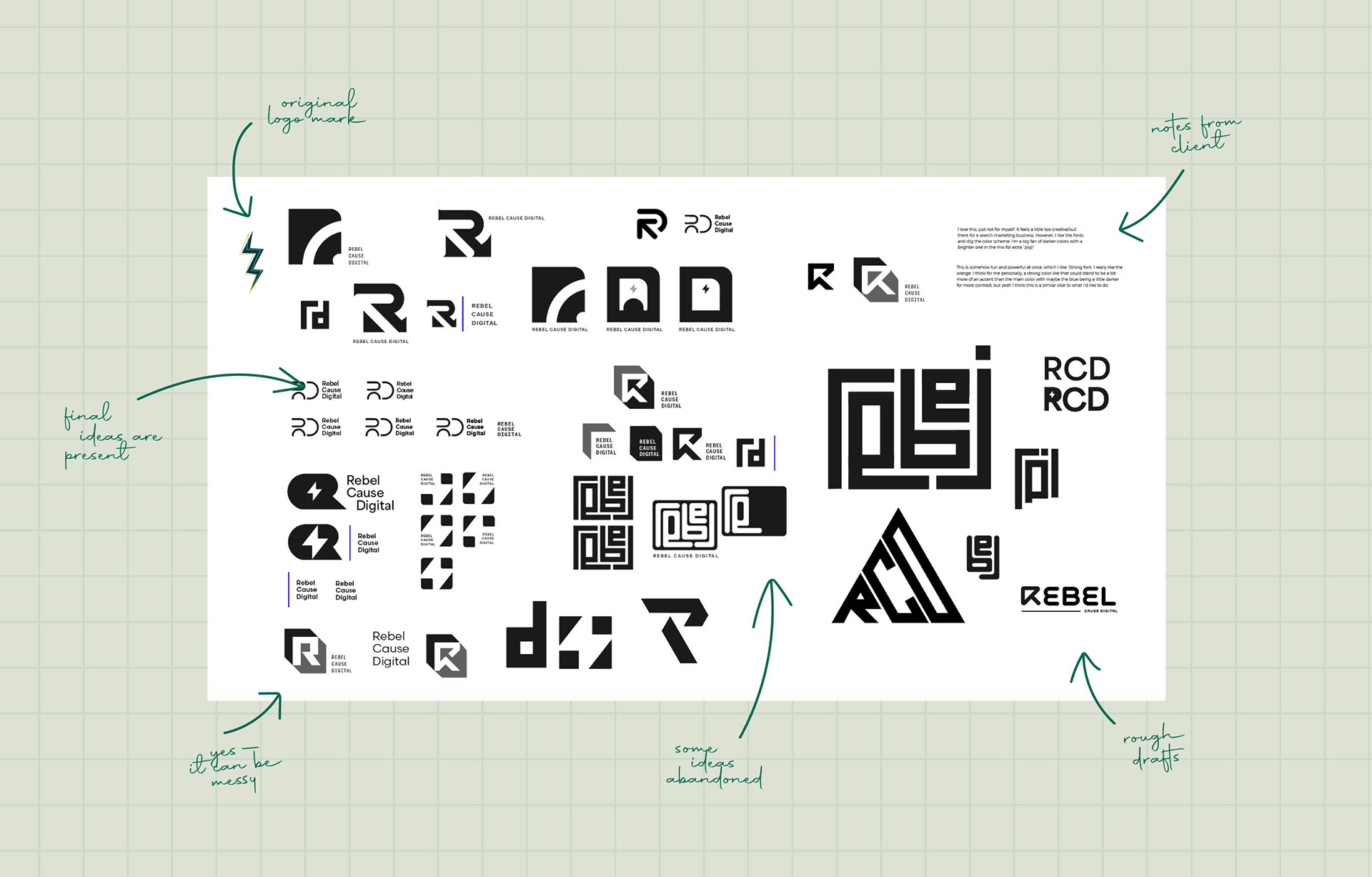
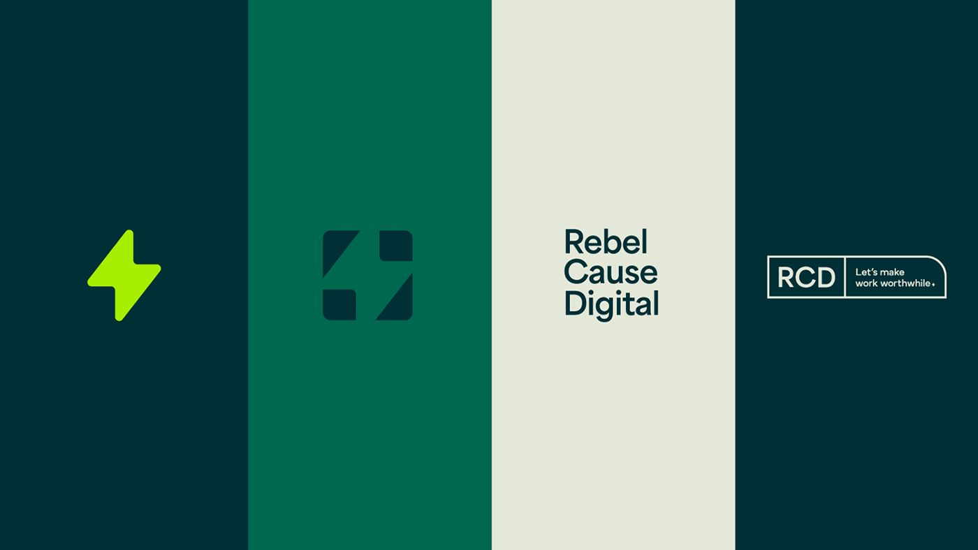
It came down to two concepts—both abstract, clean, and minimal. Most times, it doesn't work to cut and paste items from various logos together. In this scenario, it did. The lightning element from concept a was married with the typesetting from concept b. A harmonious solution was created.
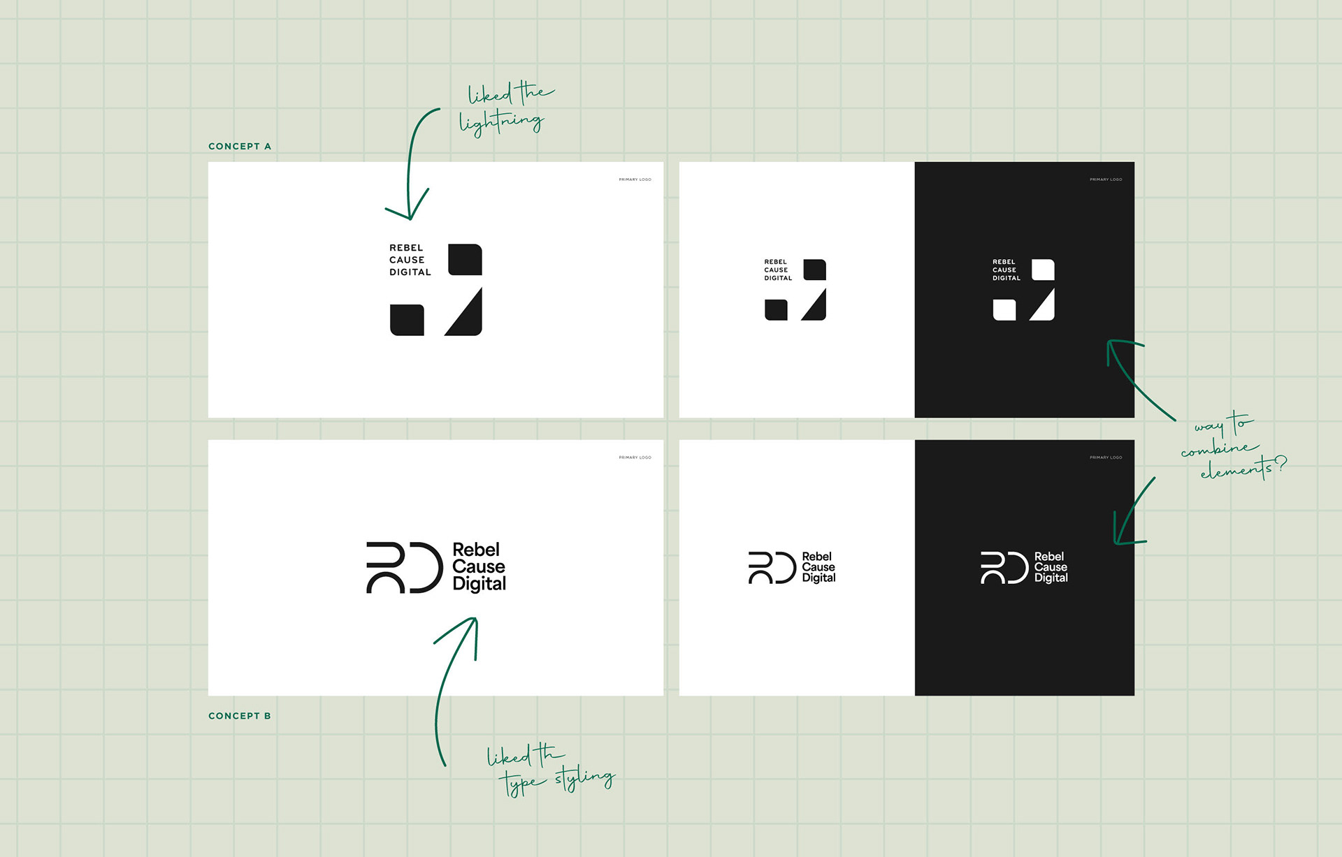

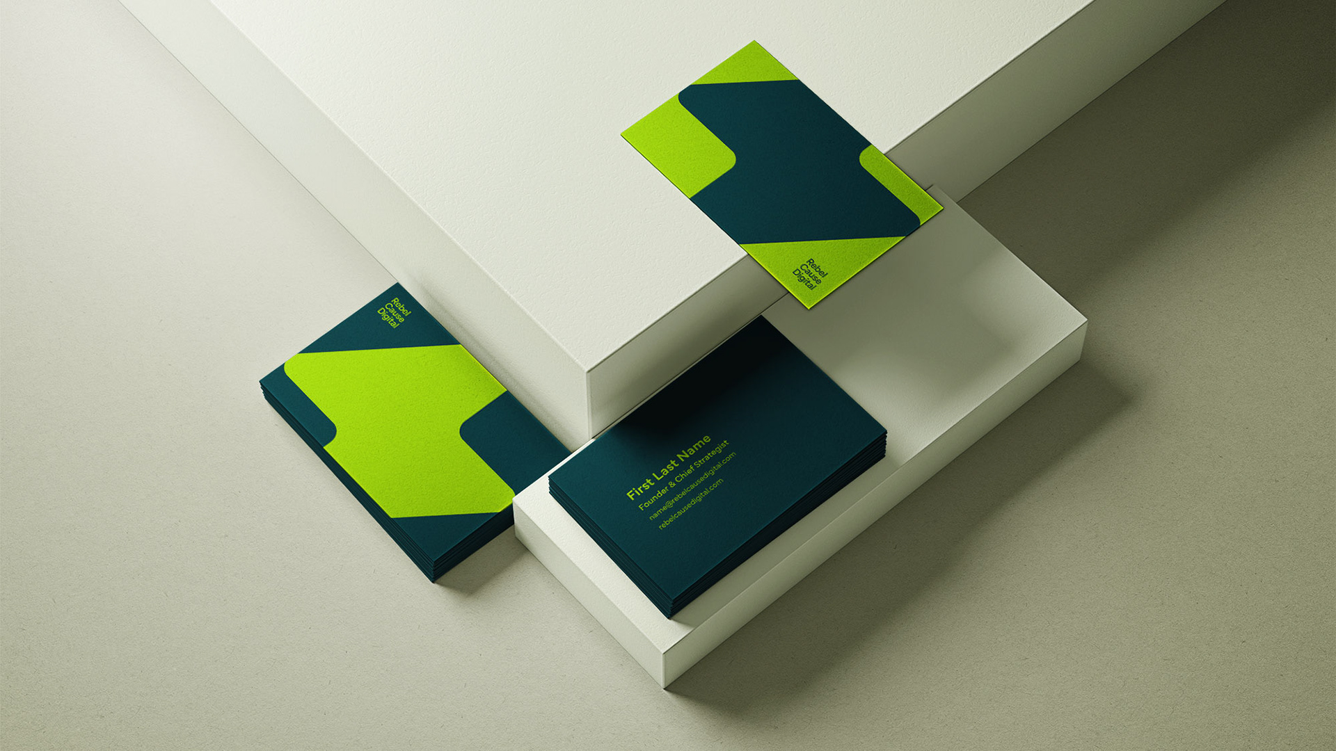
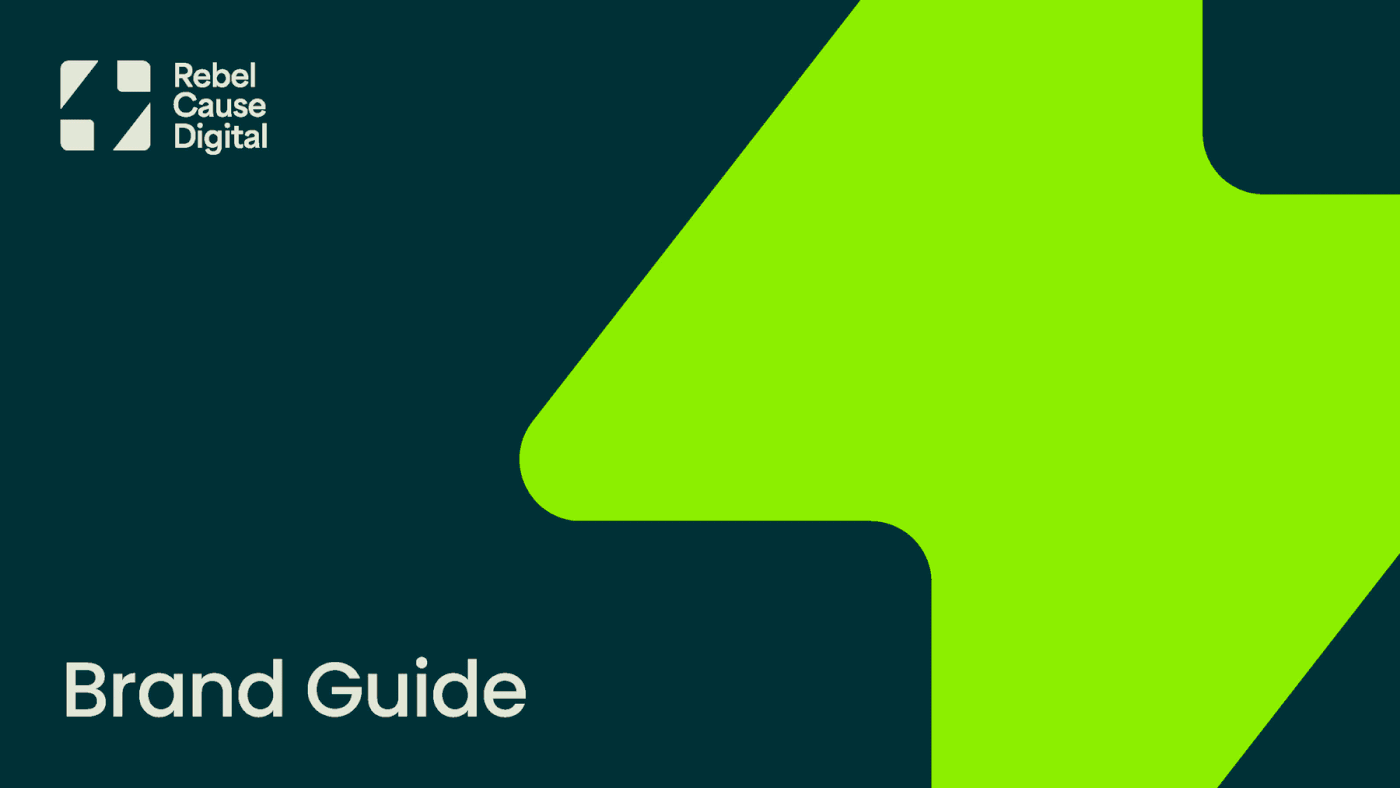
The abstract lightning bolt symbolizes the spark of creativity that underpins RCD's work. Designed with deliberate simplicity, the logo ensures clear legibility on diverse mediums, conveying bold messaging effortlessly. Paired with Poppins—a modern and friendly, yet sophisticated font—and a vibrant, exciting color palette, the end result is purposeful, effective, and memorable.