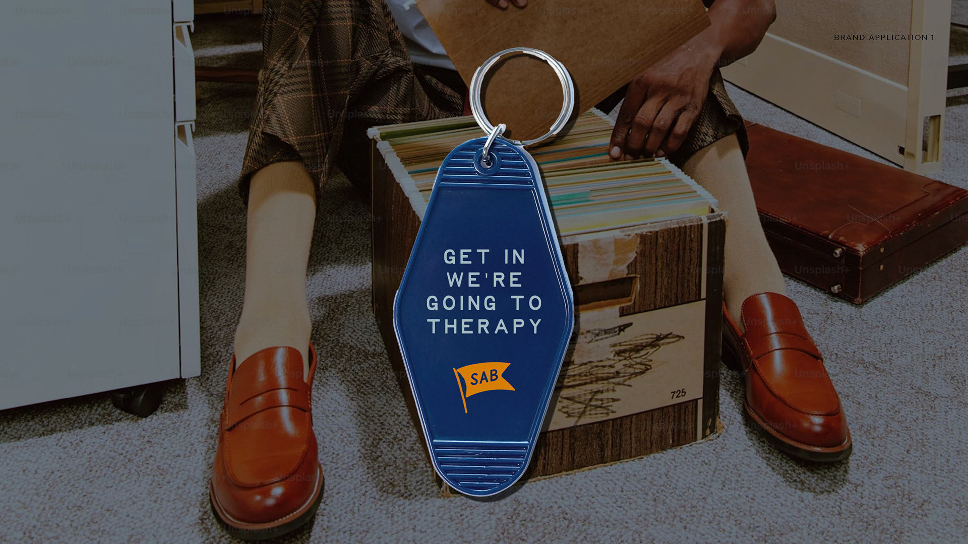
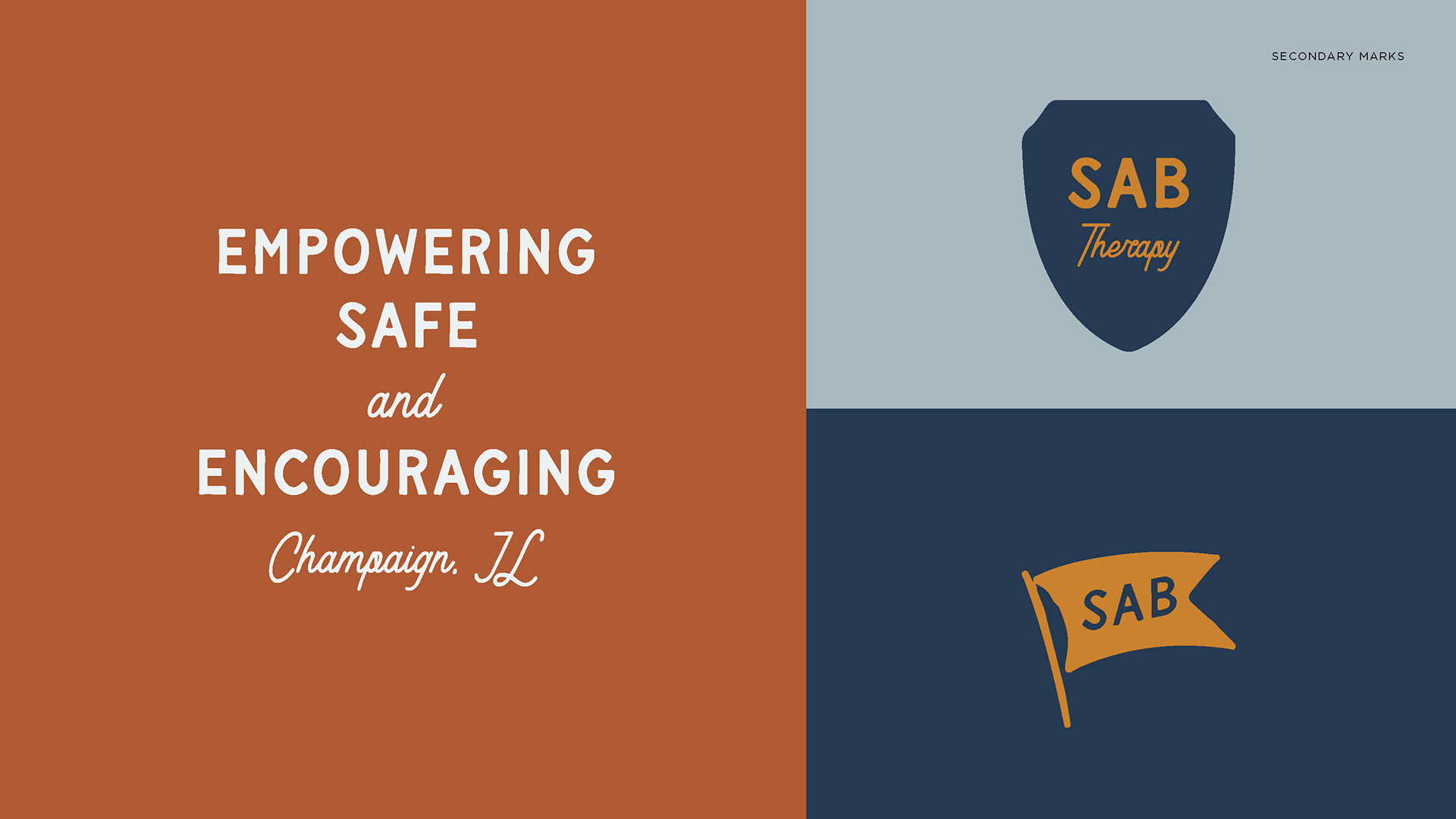
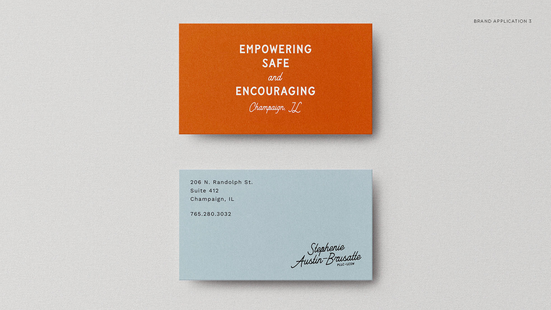
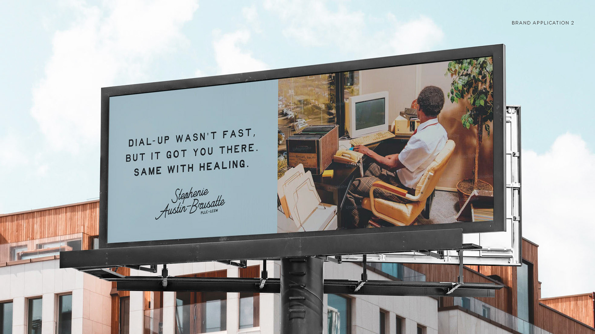
SAB Therapy
Vibrant, daring, and unapologetically unique. That's the retro spirit Stephenie needed for her updated brand identity. The creative direction leans into bold typography and confident color for a design-forward feel, offering rich potential for creative application across brand touchpoints—and a standout in the CU area as something truly original.